
With that in mind, we'll take a bit of a trip back, to July 2009 and a couple layouts from way back then. And holy crap, would you look at my memory for remembering lines, because if you're like me, you might still have
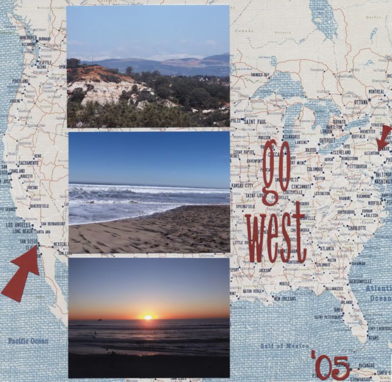
Does it get more simple than this? Seriously, though it doesn't look simple and it's because of the paper. This page is a great reminder, and example, of how to use those large design papers. Go minimal in both photos and embellishments. This was a Little Yellow Bicycle's Traveler line.
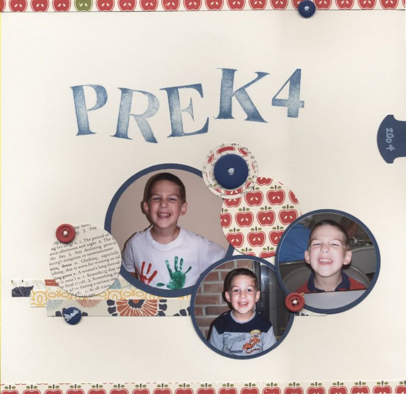
This layout has my favorite things - circles. Circles are the perfect thing for scaling. Make them bigger or smaller according to your photo. Add more photos or more patterned paper if you have less photos. String out more of them to create a two-pager. Also, Little Yellow Bicycle Traveler line (except the Apples.)
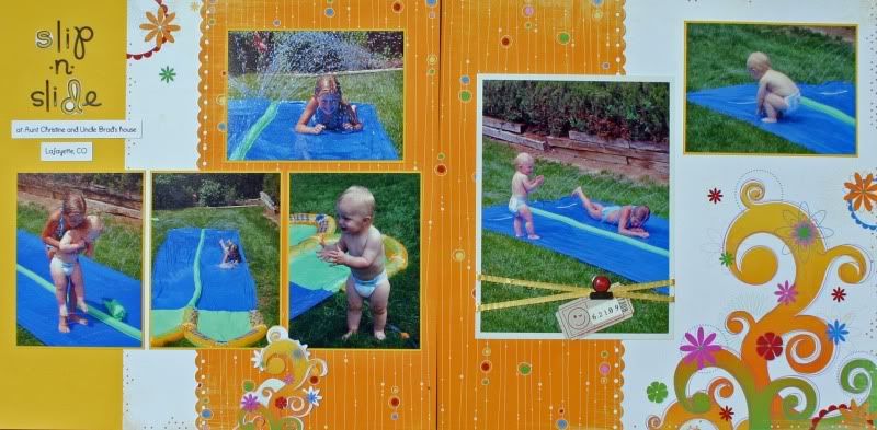
Besides this being of photo my my niece and nephew - I can't believe how little they are - this layout gives a great option for dealing with papers that have over-sized graphics. I love those papers, but struggle in incorporating them into pages. Here the paper was cut, pushing that one graphic page over the spread. Or opt to just use the right side for a one-pager. I know this line was Bo Bunny Popsicle.
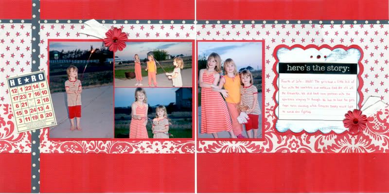
And, for the 4th of July this weekend - this was a combination of a couple lines from Jenni Bowlin, I'm pretty sure Farmer's Wife and Trendy. I like this one for the clean lines and simple photo grouping - it's an easy block to add to, or make the photo sizes different. It also illustrates a great way to combine three patterns - one large print, two small prints, with one of them being a different color to keep the layout from being monochromatic (not that there's anything wrong with that.)
I got some really good news yesterday that frees up a lot of brain space, so I may have to go clean the mess that was my studio, replace my work desk that was used in the garage sale a couple weeks ago, tuck away things that didn't sell and we opted to hold on to and play a bit, because life is great.
Happy Thursday,

No comments:
Post a Comment